Artist Sue Dowse
Congratulations to Sue Dowse for earning her place as a Winner in the November Boynes Monthly Art Award!
Who are you?
I’m an Adelaide based artist who has always loved art, whether it be as a spectator or as a participant. I graduated from Advertising and Graphic Design, SA School of Art in 1984 and then worked in an Advertising agency as an Art Director for 10 years before becoming a freelance designer. I still consider myself as a graphic designer but I am not chasing work in this area but rather spending time on my new alternative creative passion in collage art, or as I call it 'painting with paper'.
“Audrey”
Mixed Media
By Sue Dowse
This iconic pose of Audrey Hepburn is from her famous 1960’s movie ‘Breakfast at Tiffany’s’ where she dazzled as a New York playgirl. I have highlighted the Tiffany’s signature blue throughout this collage and have also utilised patterned paper, text from magazines and splashes of fluoro to make it as unique as Audrey herself.
What inspired you to utilize mixed media as a medium?
Mixed media is a term that I often have to choose to describe my work as ‘collage’ is rarely on the list as a medium. I’m not sure why that is the case as there are a lot of collage artists out there, however I feel they aren’t given as much weight as other artists. So it is wonderful to be recognised by the Boynes Emerging Artist Award with my collage artwork. The majority of my work is solely created out of paper, however I sometimes use acrylic to paint on a background colour or to add splashes of colour if needed. I was inspired to use this medium as it was a way to use recycled paper materials and print media which I feel gives my artwork a really unique look.
“Elvis Rocks”
Mixed Media
By Sue Dowse
The photos taken of Elvis Presley during his 1968 ‘Comeback Special’ inspired me to do this collage. This television special that relaunched his career featured his first stage performance in over seven years. If you scan your eyes carefully over this collage it will take you on journey through his life with references to songs, telegrams, the army, actual song music, concert tours and so much more.
How would you describe your artwork?
I would describe my artwork as colourful, detailed, unique and intriguing. I use recycled magazines, old newspapers, brochures, posters, type, maps, photos, patterns and more to create one-of-a-kind collages. My inspiration comes from nature, the ocean, animals, iconic movies and stars, music and sporting legends, fashion and food. By ripping and cutting up pages from magazines I am able to capture a moment, a movement or expression just like in a photo. I love people to lose themselves in the artwork, scanning the fine detail and each small piece of paper to discover the text and images that tell a story and intertwine to make these unique ‘paintings’.
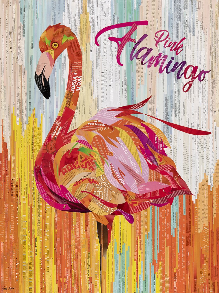
“Pink Flamingo”
Mixed Media
By Sue Dowse
‘Pink Flamingo’ is a vibrant piece of collage art that would certainly stand out as a hero in any room. It is an exciting mix of vibrant and pastel colours which contrast well together. The long strips of paper on the background echo the long neck and body of the flamingo and the overlying layers of paper on the body of the flamingo really highlight the birds fluffy feathers.
Can you discuss the inspiration and thought process behind "Wet dog shaking"?
I have two black dogs that just love water, often chasing the spray from the hose. They were out on the back lawn with the sun behind them when they shook their coats and the idea was born. I have done a lot of dog collages in the past but wanted to try to show movement in this one rather than a static face. I knew that to get this movement it would mean using lots of really small pieces of paper which was challenging and time consuming, but worth it in the end.
“Wet Dog Shaking”
Mixed Media
By Sue Dowse
Can you walk us through the technical steps of creating "wet dog shaking"?
Trying to get a reference photo of my dogs shaking was difficult, but I always like to start with something. Then I just draw up a rough sketch and trace an outline onto the canvas. But firstly I did paint the deep night blue background with acrylic paint as I wanted the bright colours to pop off the dark background. Starting with the dog I worked out the bright colour palette and then had to search through my magazines to find the right pieces of paper in the right colours. Lots of time is spent flicking through magazines finding all the colours. I like to start with the eyes and work outward cutting or ripping, placing and gluing each individual piece of paper. If the wrong colour is glued down it can be easily replaced and the artwork slowly starts to take form. Once I have most of the dog completed I start on the foreground, leaving the sprays of water until last. It really was a matter of building up each colour in the circular motion to try and get it to resemble a water spray. Finally adding the highlight white sprays that appear in front of the dog itself. My artworks can often take weeks, working on them a bit everyday. I knew this piece would be interesting to watch as it comes together so I set up my iPhone and recorded it as a time lapse. This was difficult mainly because my works take so long to complete. (These time lapse videos can be viewed on instagram - just go to my reels under suedowseart).
“Gorilla Eyes”
Mixed Media
By Sue Dowse
‘Gorilla Eyes’ is a majestic collage much like the gorilla himself. The colour of his eyes stand out from the black and white surrounds and they will follow you around the room. The use of white text, for example around his eyes, highlights the strong features of the gorilla and the black background just makes him seem more dominating.
What do you hope to communicate to an audience with your work?
That unique art can be created out of anything such as recycled magazines and any other form of print media in my case. I like to invite the viewer to come closer and see beyond the image to its construction. Within the colours are texts which I have transformed to create new meanings and these texts and images can take you on a journey. They tell their own story to be interpreted or just enjoyed. I want the audience to experience with me the pleasure which comes from producing these unique pieces. My sea turtle artworks, for example, have references to saving the oceans and the environment or my Elvis collage takes you on a journey of his life if you look closer at all the items that have gone into creating it.
“Underwater Turtle”
Mixed Media
By Sue Dowse
This majestic vibrant coloured turtle gliding through crystal blue water and popping his head up for air. Only paper from magazines was used to create this collage, no paint at all.
Can you talk about your biggest learning experience during the process of creating your work?
The main learning curve with my technique is that I have established that it works better to have one main focal point, such as a face rather than a group of people, for example. If there is too much going on then the final result isn’t as dynamic and loses impact. I tried to create a river scene with a log fire in the foreground and trees in the background and it just didn’t work and your eyes didn’t know what to look at first. Whereas if there is one main image I hope that it is bold enough to basically hit you in the face. The other thing that I still have to work on is to not get tied up in the minor details and to loosen up and look at the whole picture. Letting go and being free with my artwork is something I will always have to work on as it doesn’t come easily to me.
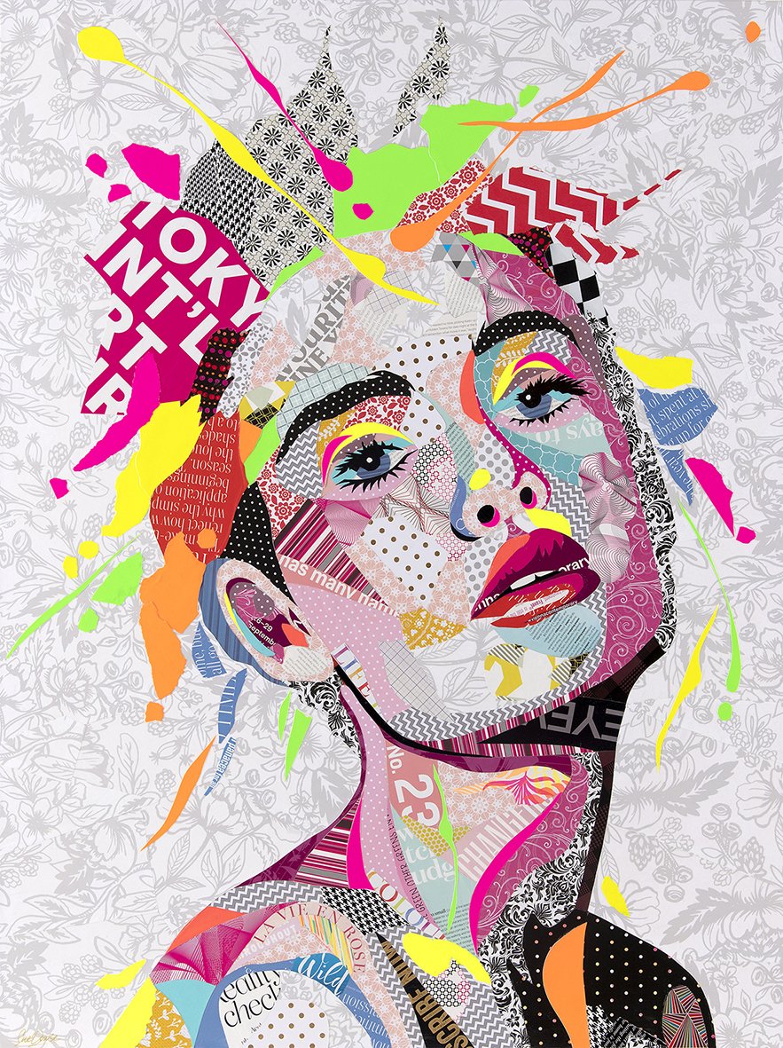
“Pretty in Pink”
Mixed Media
By Sue Dowse
'Pretty in Pink Face' uses patterned paper and type from magazines with splashes of fluoro to give vibrancy and movement. A stunning piece that will be a hero in any room!
Can you discuss your biggest success since starting your artistic journey?
Starting to have my work recognised and people enjoying it is really what I consider a success. It was a thrill to appear on the cover and inside spread of SA Weekend, a liftout from our main South Australian newspaper as an emerging artist exhibiting in SALA (South Australian Living Arts Festival). Being able to exhibit my work during SALA and through online galleries and receiving comments and feedback that help me to grow as an artist is what this journey is all about.
“Nzuri (Beautiful) African Woman”
Mixed Media
By Sue Dowse
'Nzuri' meaning 'Beautiful' in Swahili. The power, beauty and vibrancy of this woman is depicted with rich colours, patterned paper, type from magazines and touches of fluro. A uniquely contemporary piece.
Can you tell something you wish you had known before or when you began your career that would have really helped?
Learning how to recognise what it is you want to do with your art that truly makes you happy. I was trying to find a passion outside my graphic design and it took me a few years to realise that it was staring me in the face. Not to doubt yourself and realising that it is not a race and to enjoy the ride. That there is no right or wrong way to go about doing your artwork and becoming established can take years and years. That the marketing of the artwork is often more challenging than doing the artwork itself and finally to trust ones instincts and abilities. These are all things that would have been great to have known before I began but really you have to live and work through it to know any better.
“Frankenstein’s Superheros”
Mixed Media
By Sue Dowse
'Frankenstein's Superheroes' is a collage created entirely out of comic books using superheroes, villains and Frankenstein references. Scattered throughout the piece are roughly 60 superheroes, 85 creatures and villains, 40 Frankenstein images or text. Approximately 1,000 pieces of paper in total have gone into creating this classic old movie poster.
What projects are you working on currently?
I’m working on an amazing collage that I have been commissioned to do. This collage named ‘Helen’ showing her in her wedding dress and veil has been a real challenge but so rewarding and exciting to do. Using only newspapers from 1952 (other than the red) which are fragile to use often ripping or splitting when cut. Trying to create the tonal values from only these papers is difficult and finding out that the glue stains the pieces of paper also makes it problematic. It has been created to look like a ‘Pix’ magazine cover which was a popular magazine of the day in the 50’s. I’m really pleased with the result. The woman in the piece is now 92 and still looks as amazing as she did on her wedding day.
“Helen” (Unfinished)
Mixed Media
By Sue Dowse
What is your dream project or piece you hope to accomplish?
My dream project is every piece I start. It has to be that way so I put my all into it.
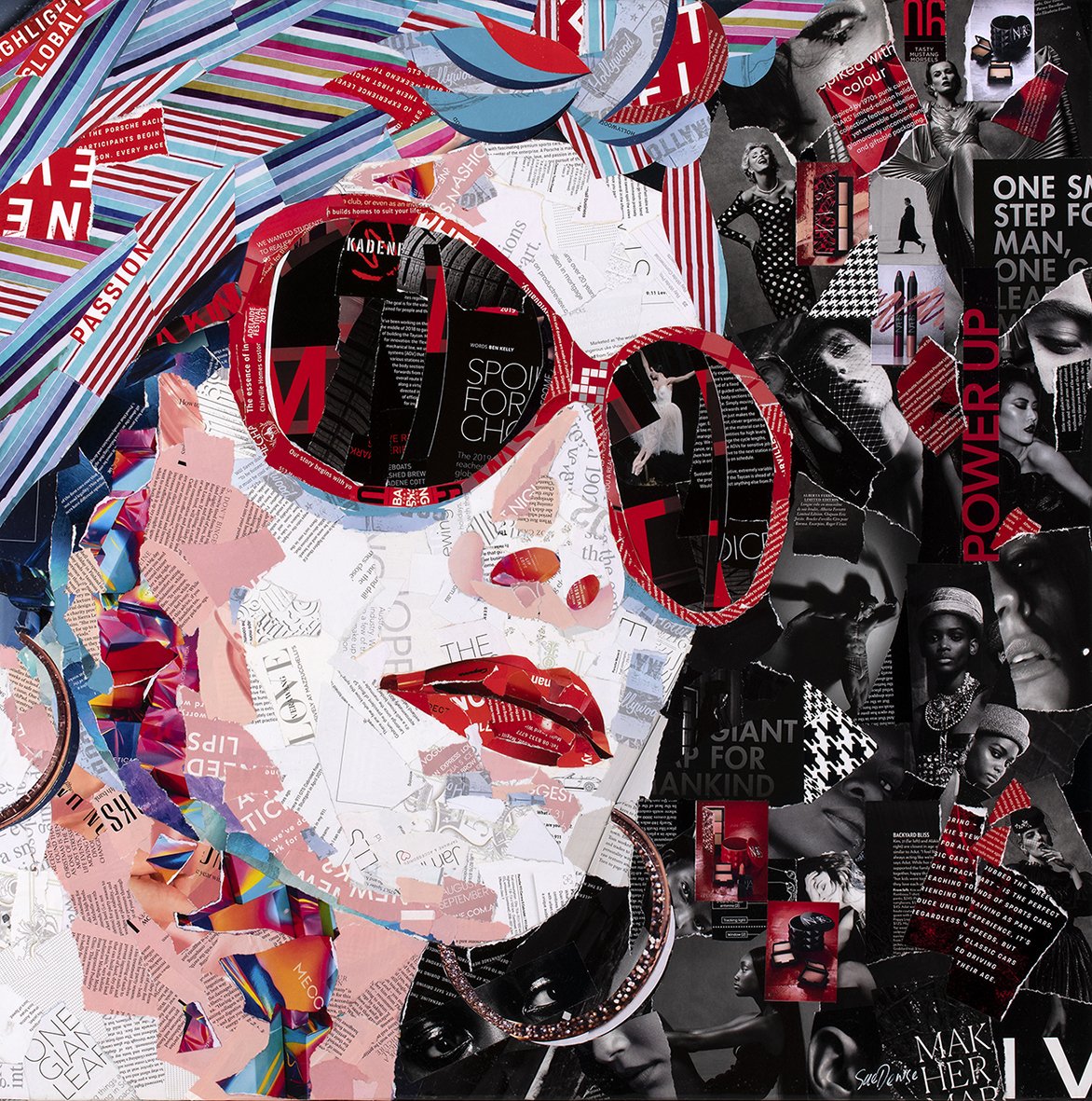
“Lady in the Red Sunglasses”
Mixed Media
By Sue Dowse
She looks like someone out of a 50’s movie with the red lips and sunglasses. Notice the dark background with all the magazine pieces relating to women, fashion and makeup. Go girl!
As a winner, do you have any advice for artists who want to submit to awards, competitions, residencies, etc.?
Don’t give up and only compare your work and progress with yourself not other artists. Look back on your early artwork and see the differences with what you are doing now, and try to learn and recognise what has worked and what hasn’t.
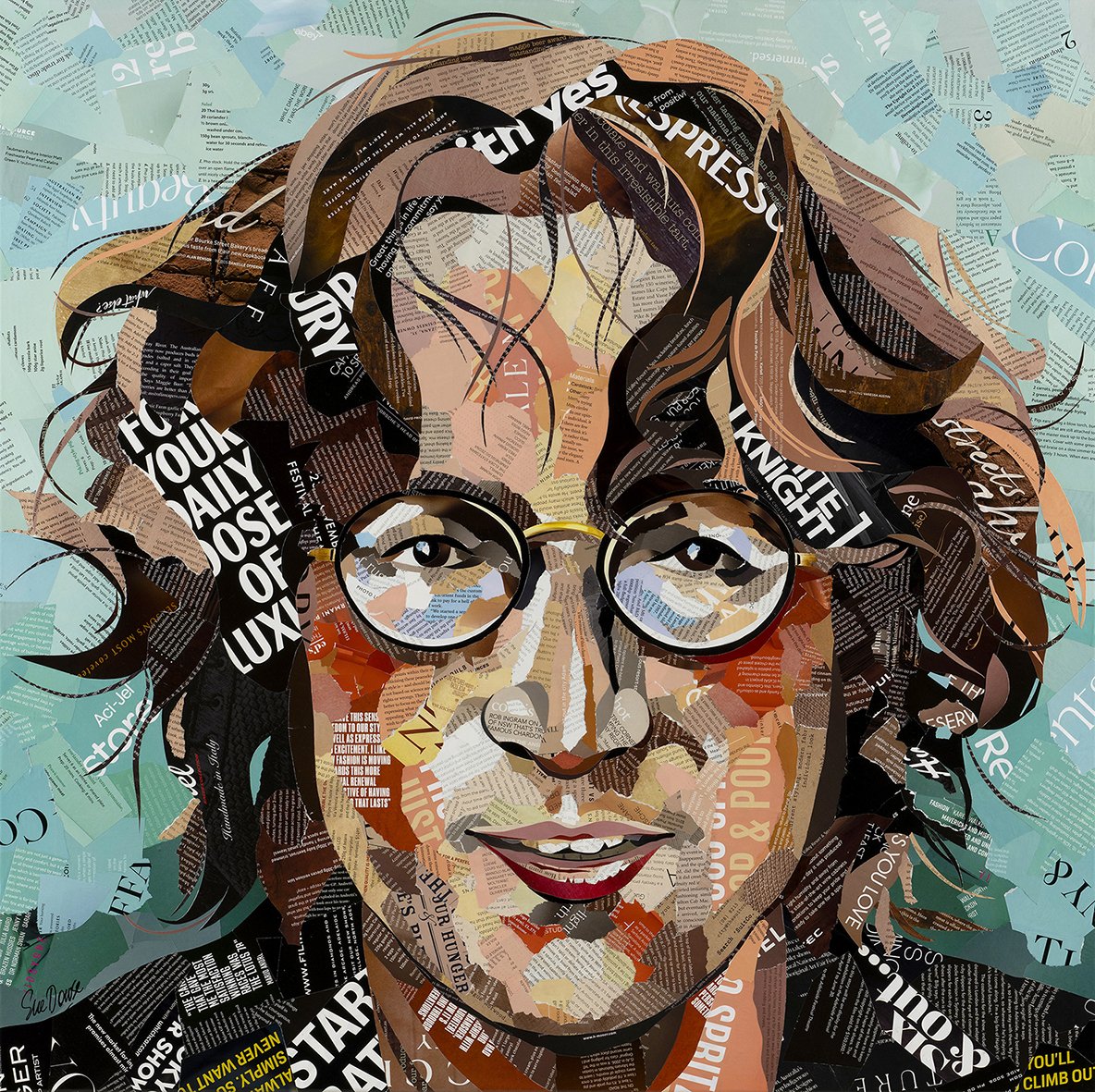
“John Lennon Legend”
Mixed Media
By Sue Dowse
'John Lennon Legend' - Fought for peace and revolutionised the power of music itself. Captured as he looked in the early 70’s. Only type from magazines has been used to produce this collage.
Lastly, I like to ask everyone what advice they would give to their fellow artists/photographers, what is your advice?
I guess it is to be brave and never be afraid to try something new, even if you may fail in doing so. Then to get back up and try again. The more failures we have the more we all learn.
To view more of Sue Dowse’s work


